Case study | Friday Grocer | Website
Better value groceries for Melbourne residents
A new eCommerce website offering a better alternative to the big chains.
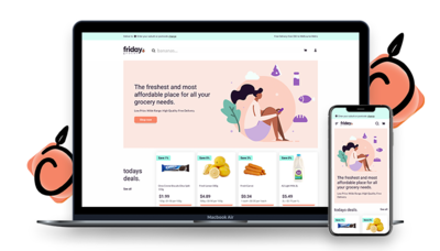
Friday Grocer is a Melbourne startup offering a more personalised, better value alternative to Coles and Woolies online grocery shopping. With no overheads from bricks and mortar stores, Friday Grocer is able to offer greater savings to their customers.

The challenge
Friday Grocer was established late in 2021 in response to an increased demand for home grocery delivery during the COVID-19 lockdowns in Melbourne. To be competitive against the big players in Woolworths and Coles, Friday Grocer knew they not only had to offer low prices, a wide range, high quality and free delivery, but also a simple ordering system. With an ever-changing and expanding eCommerce offering, the site needed to be simple to update too. That’s where we came in.
The Approach
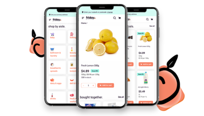
With their visual brand and desktop designs established, Friday Grocer asked us to develop their site. We developed a custom WordPress/WooCommerce site focused on UX and responsive design for easy use across all devices. We developed mobile designs based on their provided desktop designs and custom built functions such as a delivery schedule at checkout and delivery postcode search. We also set up Google Analytics tracking to help them build their community of customers through social channels.


The outcome
The new Friday Grocer website offers users a visually appealing, functional and simple to navigate grocery shopping website. Customers are able to check if their postcode is eligible for delivery, search for individual items or by category, and choose their delivery times with ease. And the site is responsive across all devices. Editability of the site is also simple for the Friday Grocer team to update grocery items, prices and other content.
Are you ready to take your brand to the next level?
Contact Us