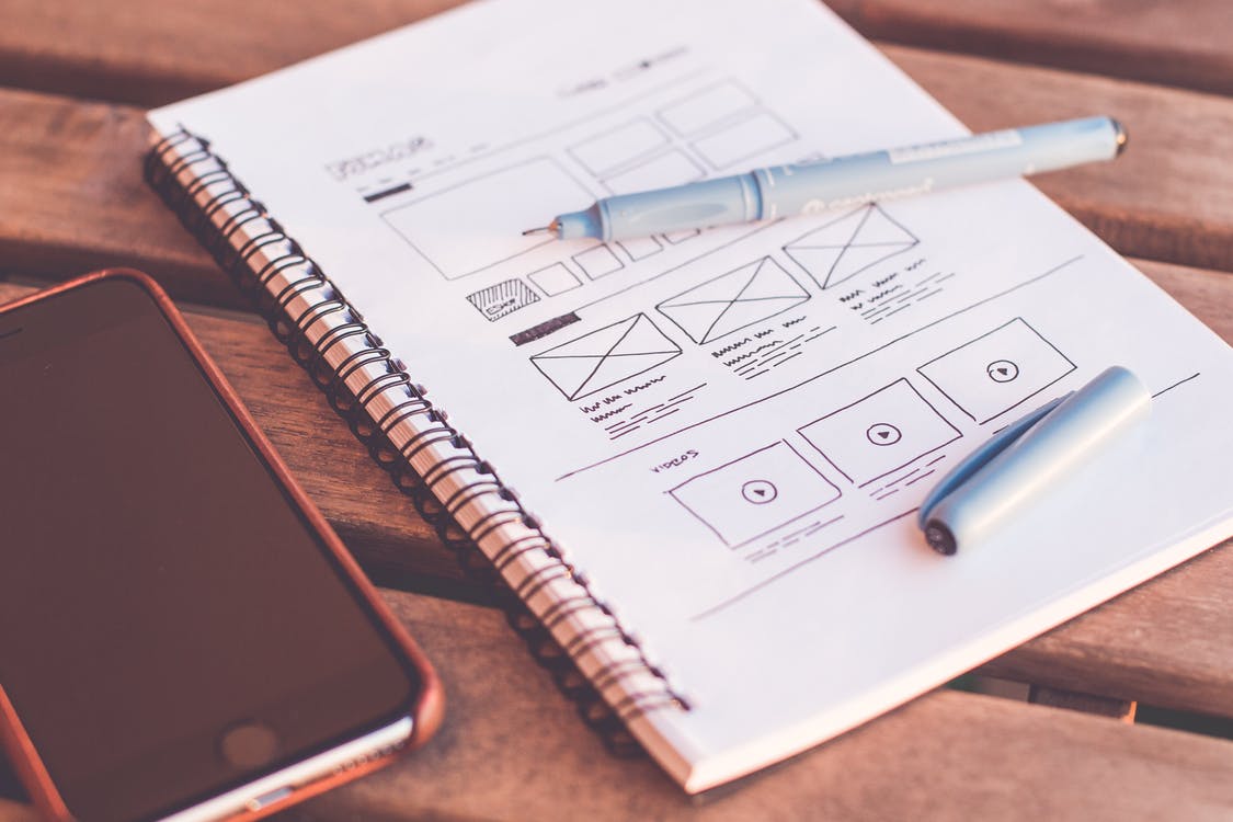
The Best and Worst Practices for Creating a Landing Page
A landing page’s purpose is to compel the user to take one specific action. But all too often, landing pages are so poorly designed that the only action the user ends up taking is to click away.
Your landing pages need to be on point to be successful. Check out our top tips on the best and worst practices.
Good: Knowing the Difference Between a Landing Page and a Homepage
A landing page is never a replacement for a proper website. You can read more about that in our blog post here.
Bad: Creating a Negative User Journey
Landing pages are all about the user journey, so you’d better make sure yours is an enjoyable one.
Your landing page should be free from clutter and distractions like too many call-outs, bold colours, and animations. Sometimes simpler really is better.
It’s also critical to minimise the number of steps the user has to take to get from point A to point B. The user should feel like they’re in a boat that’s gently cruising down a river. They shouldn’t feel like being erratically thrown to and fro in the rapids.
“The most amazing copy will fall flat when laid out on a badly-designed landing page.”
Finally, make sure to include a call to action (CTA), and make it as clear as possible. Does it look like the final step in the journey? Does it stand out from the elements around it? Do the design and copy compel the user to click through or submit their information? Your CTA is the end goal, so make sure it counts!
Good: Focusing on Benefits, Not Just Features
Your landing page might be talking about your brand, product, or service, but it’s not actually about you. It’s about what you can do for the user.
It’s important to maintain a constant focus on the customer. Don’t just list features. Explain why they would benefit the customer.
Let’s say you’re a gym with 24-hour access. Great. But also, so what? Why should the user care about that? You need to really explain and play up the benefits to sell the sign-up.
Bad: Asking Too Much of the User
People are increasingly concerned about their privacy, especially in regards to how their information is used. This means asking for too many personal details can seem like a red flag.
The information you ask of your user at the sign-up stage is an exchange, so they have to feel like they’re giving away just enough to get what they want.
Only ask for the information you need. Do you really need their phone number and home address, or would an email address suffice? There are plenty of opportunities to get further information from your audience once they’ve taken the first step, so asking for their home address on the first meeting can be too forward.
“The user should feel like they’re in a boat that’s gently cruising down a river. They shouldn’t feel like being erratically thrown to and fro in the rapids.”
Good: Including Quality Content
The copy on your landing page has to sell whatever it is that you’re offering. This is only going to be possible with quality content.
Make sure you include:
- Consistent messaging between your ads and the landing page
- Powerful, punchy headlines
- Quality testimonials that are actually believable
And most importantly, try not to be too generic. Your landing page should reflect your overarching brand tone of voice.
Check out these recent blog posts for more content writing tips and guidance:
- How to write and promote content people actually want to click on
- The 7 best online content writing resources
- 10 content writing mistakes you’re probably making
Bad: Overlooking the Importance of Design
The most amazing copy will fall flat when laid out on a badly-designed landing page.
That doesn’t just include maintaining a consistent visual theme, or designing the user journey as described above. Make sure your landing page translates well to mobile— you can read more about mobile web design here. Assign a custom URL rather than a jumble of letters and numbers, and most importantly, make sure it isn’t too slow. That’s a surefire way to make the user leave.
Good: Testing What Works
Whether your landing page is performing poorly or amazingly, you still need to test it against something else. A/B testing is the only way you can figure out why your landing page isn’t performing, or to see what you could be doing better. Even minor adjustments like image positioning, slightly different text, or a change in the colour of a button can make huge improvements to your conversion rate.
Scratching your head over A/B testing, designing for mobile, or not sure where to even start? We’ve got you covered. The team at Emote have created countless landing pages for different campaigns and purposes. Get in touch today to get started.

