Case study | Bakers Delight | Ecommerce
No Aussie snag is complete without the bun. A supplier of morning tea treats and backyard BBQ essentials, you can’t get more Aussie than Bakers Delight.
We helped them revamp their online presence to take them into the digital future.
The Challenge
Getting the Right Ingredients
Bakers Delight had a huge range of products.
We needed to make sure their new website had improved functionality and features that would be just as easy to use on desktop or mobile.
Creating a website that would look beautiful even on small devices was key. It had to be quick to load, easy to read and accessible no matter where you are. Even if you’re rushing out the door for Saturday sports.


Multigrain or Wholemeal?
We don’t always know what we are looking for.
That’s why we needed to design a simple way to display Bakers Delight’s wide variety of baked goods.
A module design with easily swappable segments would not only complement the friendly tone of the brand, but also allow for seasonal promotions. We used this as a basis for transforming their website.
Cataloguing Every Product
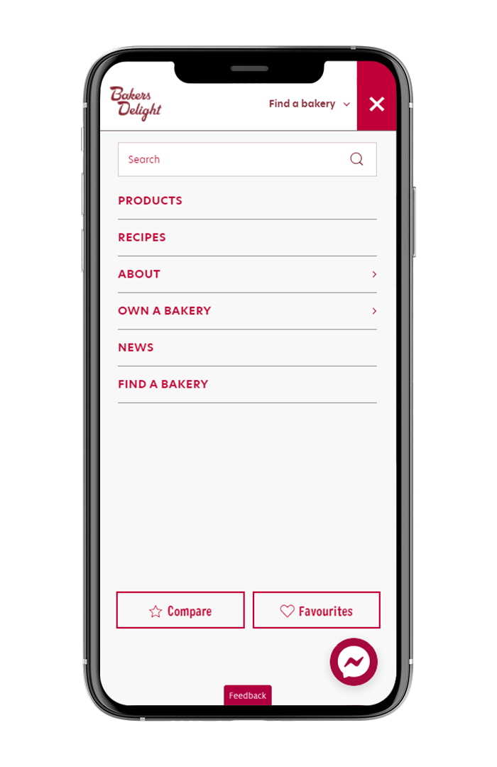
Bakers Delight had a massive range of goods on offer that needed to be able to quickly be sorted into categories. We did not want the customer to struggle to find what they were looking for.
Optimising for Mobile
With more and more customers browsing websites on their phones, the mobile site needed to work seamlessly with the desktop version.
Inclusion of Recipe Tab
We knew that adding a library of recipes would help promote the range of baked goods by helping customers discover ways to use products as ingredients. This also added great value for site visitors.
Useful Module Design
Bakers Delight had a range of seasonal and promotional items that would not be available year-round. We needed to design a website where items could easily be swapped out without major website changes.
The Approach
Proofing the Concept
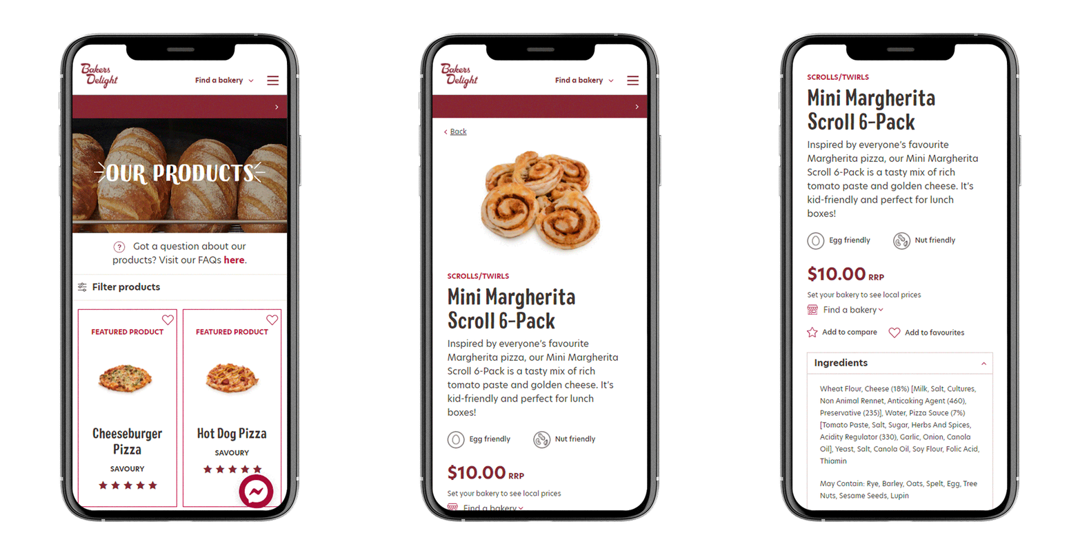
We started by asking what the needs were of our key demographic. Two key reasons stood out to why customers would visit the Bakers Delight website — allergens and ingredients, and to see what products were in season. We knew that making the website as visual as possible would help with ease of access. Especially when used on mobile.
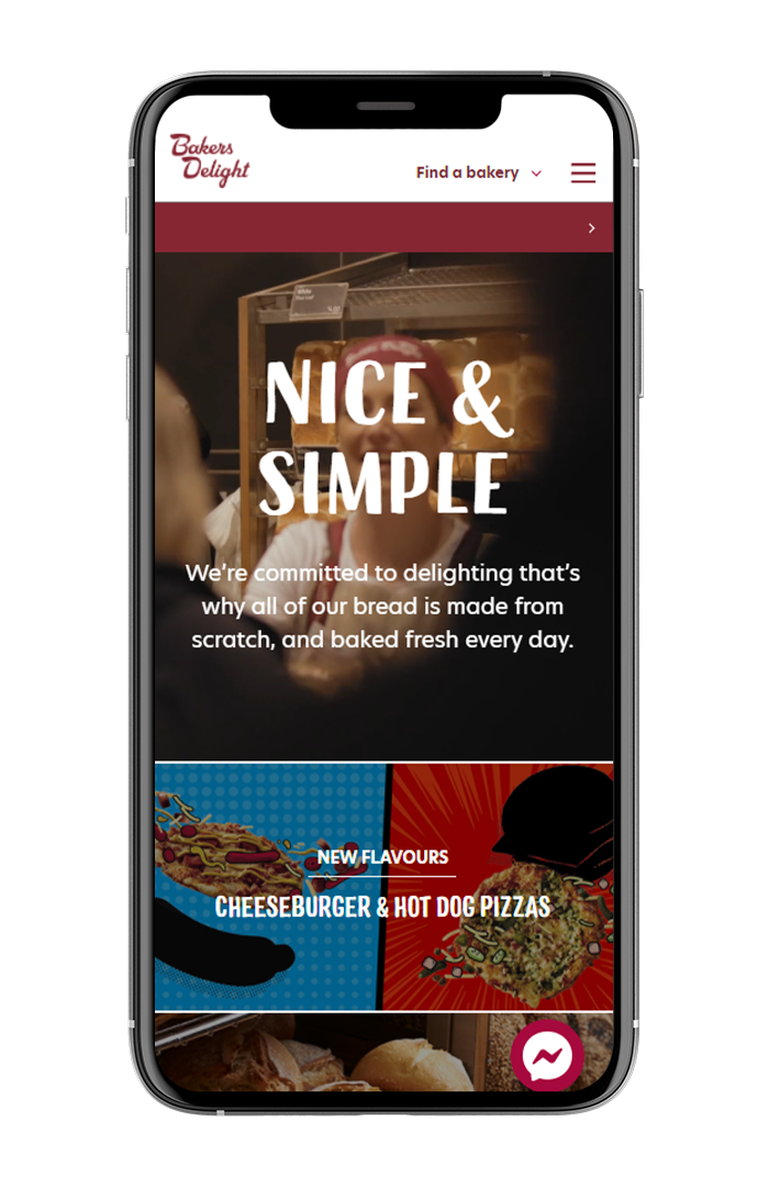
Nice and Simple
Clear, visual information broken down into modules not only makes the website visually interesting, but helps ease of access.
Not Just Buns
The inclusion of a recipe tab not only adds visual interest to the site, but works in perfect conjunction with any promotional and seasonal campaigns. We have seen particular success with Back to School and Easter promotions.
Food Friendly
Clear dietary information should never be hard to find. Not only can you filter products by categories such as Low FODMAP, Vegan and Nut friendly you can also quickly click on an item and see every single ingredient.
Mobile First
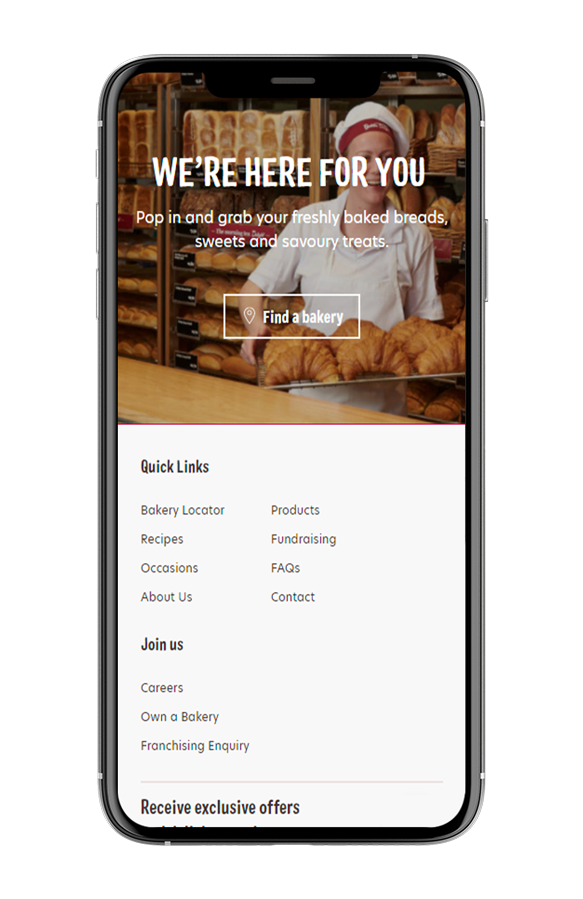
The final website works brilliantly no matter what device you are on without compromising on the look and feel of the site.


The Outcomes
Out of the Oven
The new website keeps the home-baked feel of the Bakers Delight brand with a modern website design. With a specific focus on user experience, we have designed a website that you will keep coming back to again and again.
With a modular design that can be easily customisable for each season, it gives Bakers Delight great flexibility without completely needing to change their website.
Finding your morning tea treats has never been easier.
Are you ready to take your brand to the next level?
Contact Us