Case study | Newline | Ecommerce
Newline Cushions came to us with an established brand and an exciting new direction and we worked with them to plump up their website.
Newline Cushions creates purposeful interiors that express your individual needs, style and personality. For 15 years they’ve been dedicated to elevating spaces using their sole focus — cushions.
The Problem
They have so many great aspects of their brand such as being family owned, Australian made, fully customised to the individual and an empowering ethos.
The only thing Newline didn’t already have was a fresh and engaging digital presence. That’s where we stepped in.
We needed to transform how Newline’s website looked, sounded and navigated to connect with their target audience. The site also needed full functionality as an online store and for the sales process to be enjoyable for the user.


The Approach
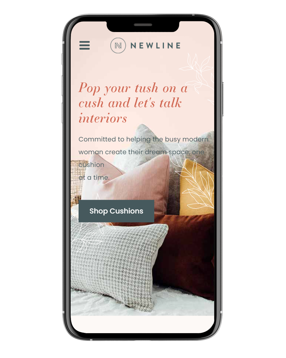
For a brand that is all about design and aesthetics, it was crucial that their website looked fab. To achieve this we implemented beautiful and bespoke website design.
We developed the website on WordPress and Woocommerce to create a holistic eCommerce platform and give the flexibility to customise according to requirements and develop more closely to designs and functionality.
Robust, reliable, and an easy-to-navigate experience for backend admin made this the best approach for Newline. Plus it’s a scalable solution to match their big ambitions and future proof their business.
For the design, we firstly developed brand guidelines. These establish rules for the brand to utilise consistent visual elements to deliver a cohesive aesthetic.
These brand guidelines also laid out Newline’s key messages channeling creative and clever copy. From the headlines to the About Us page, down to the newsletter sign-up CTA, we made sure the copy for Newline was working hard to give life to their brand.
The Outcome
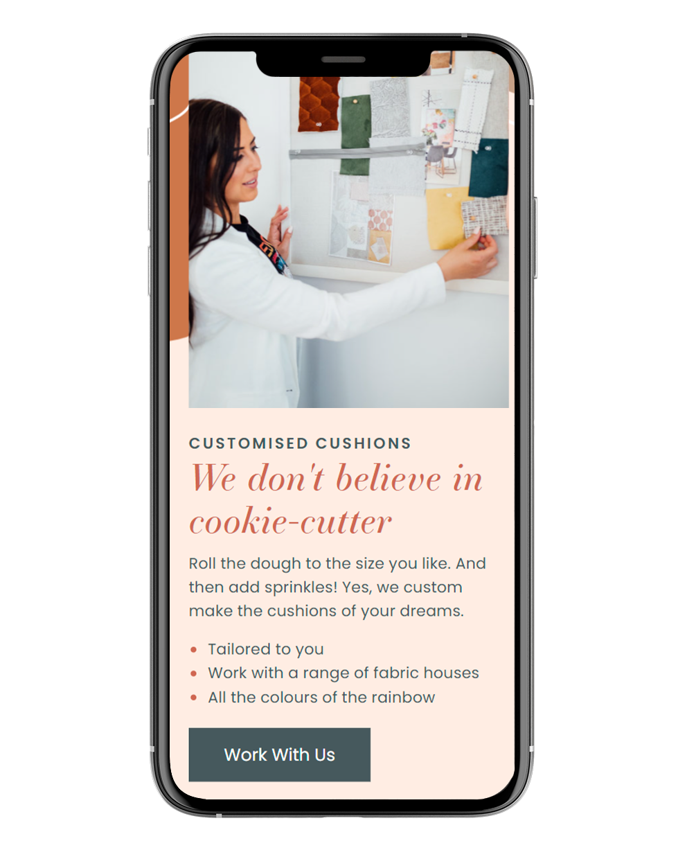
A combination of smooth UX, clever copy and gorgeous design.
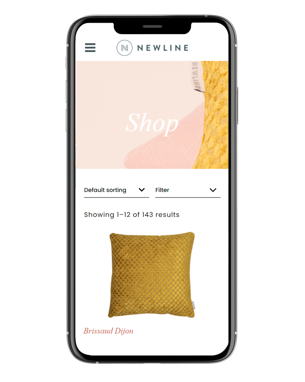
By upgrading the user navigation to be more streamlined, we made sure the journey from browsing cushion styles through to purchase is totally seamless, encouraging less decision fatigue and more conversions. This is crucial for an eCommerce site.
Newline’s brand values are now highlighted up front and the website has a high level front end polish with animations and GIFs (always a crowd favourite).
The illustrative components for web represent Newline’s style and help users focus on what’s important — the cushions! The bespoke leaf motifs draw upon natural inspiration, shape and linework to create intriguing visual elements.
So pop your tush on a cush and go take a look!

“I am so grateful for all the wonderful humans who had a part in the brand refresh of Newline Cushions”
Adriana, Newline Cushions
Are you ready to take your brand to the next level?
Contact Us