Case study | OnCall | Website
Providing vital services to those in need, OnCall required a website that was both accessible and informative.
The Problem
Finding the right help should be easy. OnCall’s previous site was crowded, and key information was buried under walls of text.
Their new website also needed to consider that people with different needs would be accessing OnCall’s website. Creating an easy to navigate UX would be key to making the website really work.
OnCall didn’t just provide care, they also offered training and staffing solutions which was hard to find on their previous website. We wanted to highlight all the different roles OnCall was capable of, without ever overwhelming a potential client or lead.

The Approach
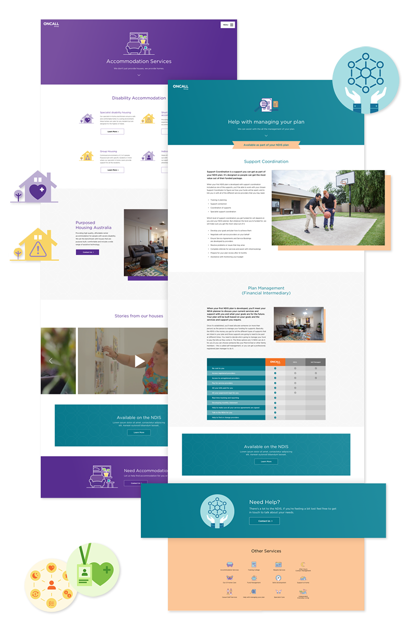
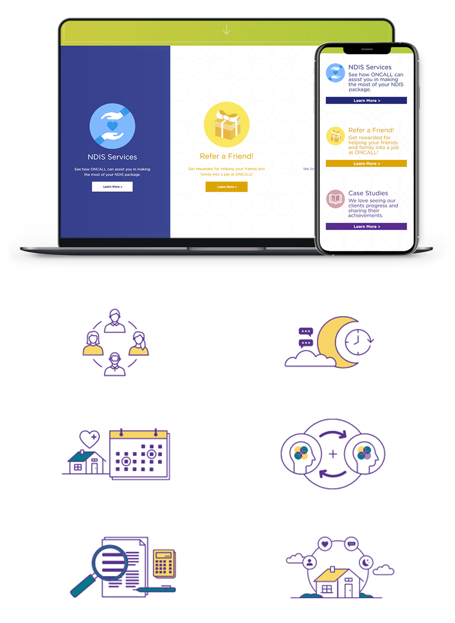
We began by creating a sitemap that you couldn’t get lost in. A simple and modern UX that prioritised condensed information with a suite of infographics that would suit both clients and carers.
The integration of Healthcare Manager also allowed us to design a website that could be easily updated with key information and job postings. We used Zoho CRM for form fills, which allowed us to pull all jobs and information directly into OnCall’s website.
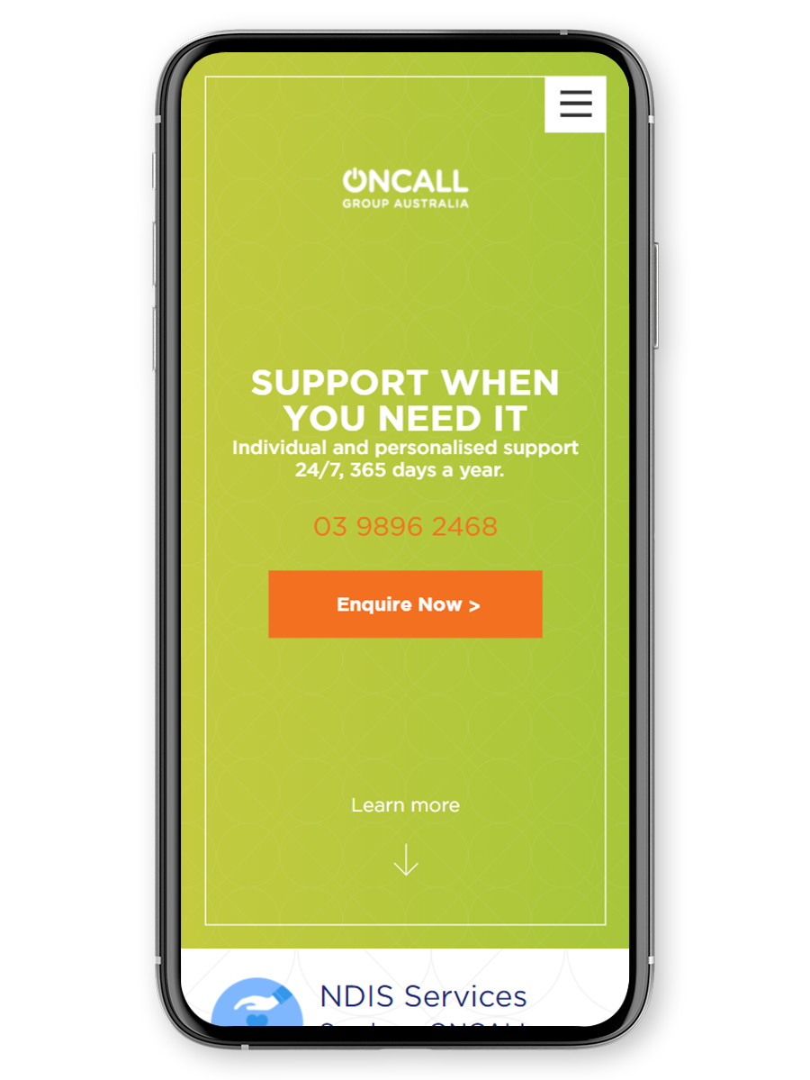
OnCall’s website needed to be easy to access and clear in the services they offer.


The Outcome
The results are a website that is completely accessible with an easy to navigate UX that allows both potential clients and carers to find what they need. With a range of specialty graphics and icons, we brought the site to life, while also keeping it friendly and informative.
We also designed a custom enquiry form for the NDIS that has been key to generating new leads. OnCall’s wide array of support and job options are all clearly displayed and easy to find, supported by a back end system that makes content management easy.
The new website matches the warm personality of the OnCall brand — but still has all the information you need.
Are you ready to take your brand to the next level?
Contact Us